Rakontu screenshots
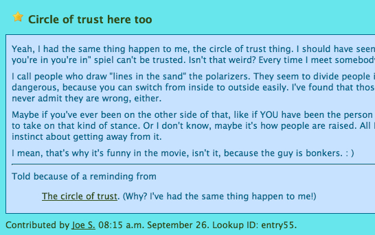
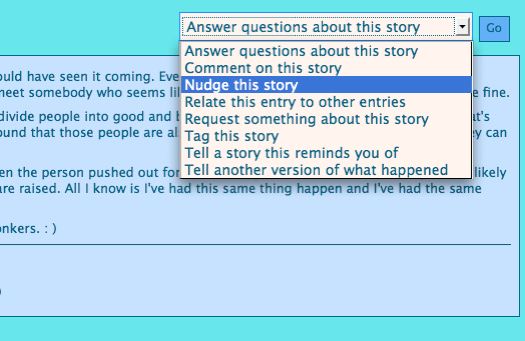
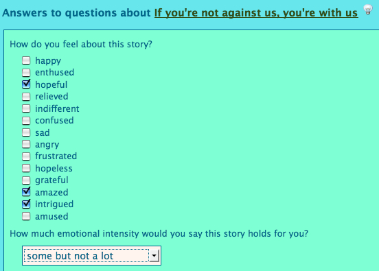
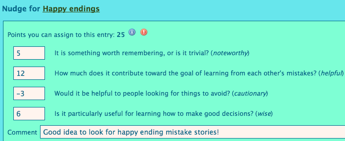
These screenshots show you what Rakontu 1.0 looks like for a regular Rakontu member. For other screenshots see these pages:
The home page
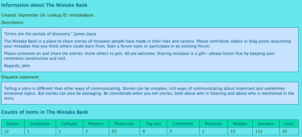
| This is what it looks like when you first come to any Rakontu site. In this example the person belongs to two Rakontus. You enter the Rakontu by clicking on a picture or link. (The second Rakontu here is based on the Mistake Bank, a site run by John Caddell, who graciously allowed me to use his site's name as a test case.) |  |
| The top of the window looks like this. The Rakontu's picture is at the left; the member's picture at the right; and drop-down menus in the middle. |  |
| Here the member looks at the Rakontu's home page, where stories are shown in a timeline. Recent entries are to the right; entries nearer the top have been "nudged" (rated) higher; and larger-font entries have had more activity around them. Here details are turned off so only titles are showing. | 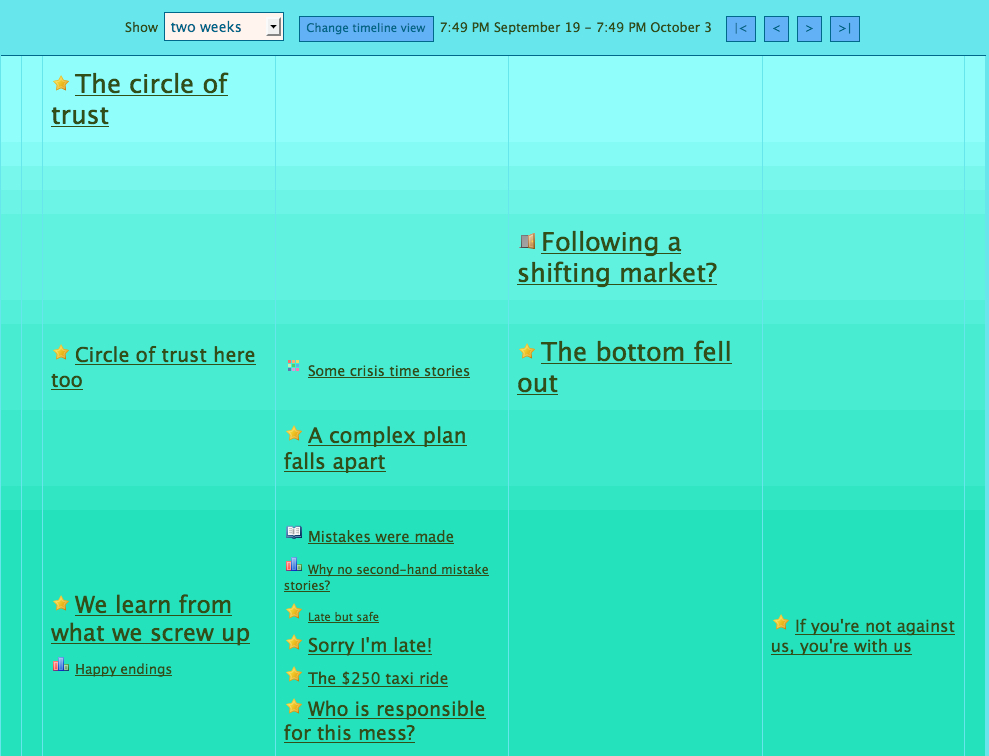 |
| The member turns on details and sees (in this excerpt) one collage, one invitation and one story. The little icons after entry names represent annotations to the entry. |  |
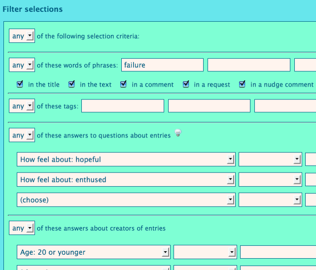
| The member looks at the view options available. They can choose which types of entry to look at (besides stories there are invitations, collages, patterns and resources); which nudge categories to consider in the vertical placement; and a search filter to apply. |  |
| Here the member sets the "nudge floor" low, and a spam entry appears, which has been nudged down low and flagged for deletion (see the little red flag?). |  |
| The member gets confused, clicks on "Help", and finds all of these resources. (Note that these are all editable by guides or managers, so people can add their own tips to them.) | 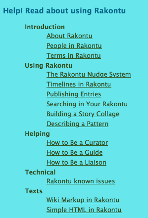 |
Looking at individual items
Telling a story
Looking around
Changing the member's profile
| Now the member decides to change their profile. | 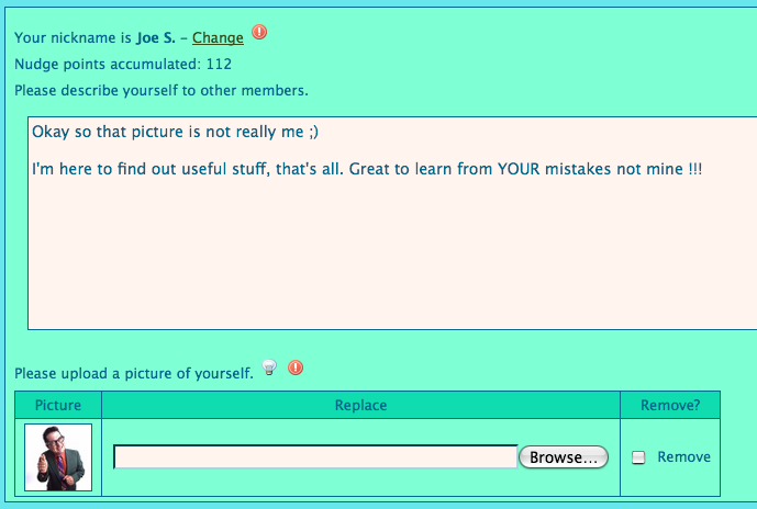 |
| They answer some questions about themselves. | 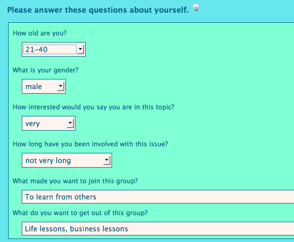 |
| They look at the profiles of other members. | 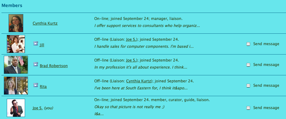 |
For more screenshots see the pages about helping roles, managing, and administering.

